Katie Scott (@katiekatiescott) has a wonderful eye for nature. Few artists have successfully taken the reigns that Ernst Haeckel started in the 1800s. Not only does Katie pay attention to all things wonderful that comes from biology and nature, she is keen on color and design.
Her color pallet is less saturated and muted yet delicate and harmonious; arguably a vibe or mood that could be continuous with being out in nature, as nature can be both mysterious and wonderful.
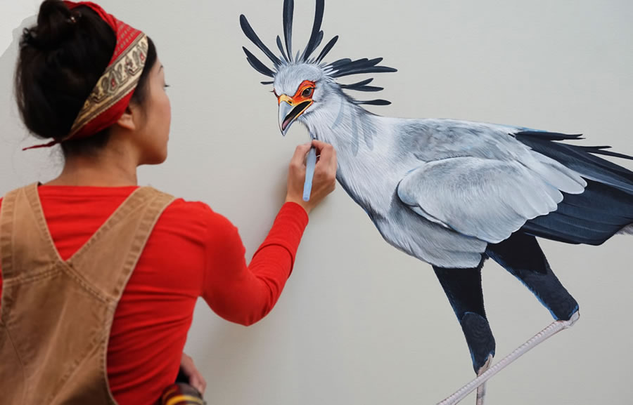
Her illustrations are even more successful on real-world objects. They can morph from scientific references to patterning on clothing and it both works.
Check out Katie Scott on Instagram (@katiekatiescott)
Sometimes in order to study, it’s a good idea to take a look at a 3D version. Sometimes 3D diagrams are expensive, and only available in science labs. That’s where Origami Organelles come in!
Printable, hands-on and easy to assemble, you can study in a new way.
An amazing Instagrammer to follow is Artist Tyler Thrasher (@tylerthrasherart). He takes curious specimens, such as seashells, wood, even insects and skulls, and grows real crystals on their surfaces. You can also peep at his science-inspired photographs, paintings and drawings. As with all of his talents, this oddity artist creates artwork that is truly unique.
What is most spectacular about this artist though, as a chemist, he makes especially sure that his specimens are made with quality, precision and care. According to his Instagram and biography, he creates these crystals with his knowledge of molecular biology and crystallography. He says the chemicals he works with are dangerous and even fatal, making each project a risky operation.
A nurse named Tilda Shalof created an amazing mural made completely of plastic bits from her profession. The plastic she collects consists of (sterile) parts of medical devices that would normally be thrown away, like lids from viles, syringes, and tube connectors. This mural exposes a time line of the hard work and commitment that goes into being a nurse for 28+ years, as each dot in the mural is a symbol for doing a specific task that she routinely does throughout her work day. Not to mention, all of that plasic that doesn’t end up in landfill.
This is a gorgeous chart of all the Birds of North America. Each bird is designed with just enough color and shape to describe each individual bird species; a reasonable decision made by the artists of popchartlab.com that I completely agree with. Why make unnecessary details of each bird, when you know you have so many to make?! If you look at all of their work on their website, reduction is also their style, but that also means that this daunting project is not their only one. For some artists, it is a challenge to not get into detail; it’s so temping to describe each specimen with as much information as you can get. But sometimes it’s not necessary, and in this instance, it certainly works for me. The overwhelming amount of birds themselves is enough detail (not to mention fitting them together in a Golden Ratio-type layout). I hope the team at popcharlab.com continues to create more taxonomy-styled posters like this one.
On the other hand, some artists must prevail with detail. And who else is more successful at creating exquisitely detailed, ornithological illustrations other than Jane Kim? The science illustrator who painted the Wall of Birds at Cornel University. Of course, it is the detail that makes her work so stunning. She takes care to paint every light and shadow of every feather and in the correct direction, all the while making sure every detail works harmoniously.
Either extreme is completely reasonable when it comes to taking on a task like illustrating 200+ birds. It is true that you can still create successful pieces of work no matter how much detail.
Viral internet videos have no bias. If something is interesting, then it is exactly that and people can’t help but watch and share. It’s now known that one sure way of getting information, i.e. scientific information, to the rest of the world is by creating lively and enticing videos. The popular “white board” animations have been on the internet for a while, which have allowed many to create their own interpretations. Although, like most things on the internet, some are more successful than others. It deems worth it to find out what those differences are.
AsapSCIENCE is a very popular blog (almost 7 Million subscribers) written by Mitchel Moffit (@mitchellmoffit) and Gregory Brown (@whalewatchmeplz). So popular in fact, that Mr. Bill Nye himself, is featured in some of their videos. It’s no wonder he’s in them, since these videos have a clever way of creeping science literacy into the popular eye via social media. Each video is easy to watch, quick, and entertainging live white-board drawings. Not only are they fun to watch visually, but they are usually about a familiar and curious phenomenon; the things almost all of us have thought about, and yet, we may still haven’t investigated it for ourselves (hence hankering to our curiosity). And the great thing is, AsapSCIENCE tells us what we want to know without us having to look it up. Furthermore, all the videos leave us with a satisfying answer. Including answers to questions like: “Why Are You Always Tired?” “Are You Above or Below Average?” “Are Boys Smarter than Girls?”, and going as far as “Is Your Sexual Fantacy Normal?” and “Does Everybody Have a Gay Gene?”
And then there is this video, posted by Cold Spring Harbor Lab, a research facility located on Long Island, NY. This video, which is the only video of it’s kind amongst all their other YouTube videos on their channel, it borrows the same idea as AsapSCIENCE. That is, it consists of colorful, live white-board drawings, to get (and keep) viewers interested. Except it is not a topic that most of the public thinks about. Instead, it’s about Spinal Muscular Atrophy, something only a select number of people probably even know about. Mostly those who have the disease, or know people who have it. Thanks to it’s colorful, hand drawn delivery, once you play it someone who neither has it or knows someone who has it, they might actually find themselves learning about something they didnt even know existed, dispite it’s heavy vocabulary.
Osmosis’ videos on the other hand are not exactly meant for the general public. They use the live white-board drawing approach to make it easy to watch, mixed with the learning style like that of Khan Academy. That’s because it’s meant for students learning medical topics. The public might find these videos interesting if they had a specific question, but it’s filled with science goodies that probably won’t be useful to them.
Now, when it comes to full-blown animation, it’s so easy to be stiff and dull (attributes that white-board drawings are meant to avoid). And when it comes to science, there really is no reason to be either of those things. TED-Ed animations are never that way. Each video, with their millions of views, they take live drawings to a new level about scientific questions that are interesting for beyond every-day human curiosity, with titles like “How Does the Heart Pump Blood?”, “Addiction”, “Why Do We Dream?”. Those animations poke at the potential scholar in all of us. TED-Ed animations are like the National Geographic of the internet, they earn some kind of respect, and if they were glossy magazines, they’d be proudly collected in sets that live on the shelf like a trophy. This is what white-board animations are living up to, the animations that seem to express more control and imagination, at the loss of that “human” touch of learning like we all did when we were students in a class room.
The white-board animation does give you a nostalgic sense, one of maybe that time when you really learned something from a teacher in class. And if that is the hook that draws you in, it’s the live drawing that keeps you there. There is something mesmerizing about seeing a line become a shape that becomes a recognizable illusion of an object. And it’s those illusions that put together the concept from illustrator to viewer.
Colorful, playful, fluid, and scientifically accurate… these illustrations offer the basics in a truly beautiful way. Unlike most medical Illustrations; the almost intimidating kind that demand a respect that the viewer just might not have, Rachel’s illustrations invite you in regardless. I can take my time on each detail, as much as Rachel took her time to perfectly place each playful structure in relation to each other, making them believable as much as they are non-invasive. They are perfect to be hung ironically in a doctors/chiropractors office or very seriously in my studio for inspiration to remind myself to loosen up 😆.
After a long two year dry spell away from my favorite dry media, colored pencils, I finally decided that I’m drawing today. Almost every attempt to draw in the past, I found so many reasons to be distracted, so today I decided that’s silly. This is my first drawing with Caran D’ache pencils, and I’m completely hooked.
Recently I’ve taken two illustrations that I made in graduate school and revamped them (the anterior and lateral skulls). I was having so much fun editing them, that I decided to go further with the same style and create an entirely new illustration of another view of the inside of the base of the skull. What I wanted to accomplish with these, was to create a clean, easy to read, vector. I wanted the line variation of thicknesses to create a light sense of depth. I chose colorful, but not-too-far-from-unrealistic colors, because I wanted the bones to be distinct, but not distracting.
What I love about this animation, besides it’s important message concerning coral reefs, is it’s visual interpretation of underwater sea-life. This animation has a unique sense of depth while using flat 2D elements (which leads me to believe that it is in fact made in 3D, but given flat shaders). No one wants to feel guilt for demise of coral reefs, but you are sure to keep watching the entire 2 minutes 22 seconds of this animation because of the visual intrigue (as well as an honest sense of wonder that Dr. Marhaver sparks). There is an illusion of space outside the frame that keeps me in a constant state of being on a cliff hanger. The color scheme is non-invasive, with a continuous harmony of salmon pink, ultramarine blue, cerulean blue, and tan. No wonder it has over 1 million views.